
TL;DR
Most e-commerce templates are built to impress buyers in a marketplace preview, not to convert customers in a live store. The real difference between a template that sells and one that just looks good lives in the architecture: the checkout flow, product page structure, trust signal placement, mobile behaviour, and speed. Generic templates add bloat and hidden costs. Most buyers never check the checkout page before purchasing, and that is exactly where stores lose customers. Choose a template based on the decisions baked into it before you ever opened the preview, not the aesthetics you can change after.
Most people buy an e-commerce template because it looks good in the preview. Clean grid. Bold typography. Lifestyle imagery. They imagine their products in those slots and hit purchase.
Six weeks later the store is live. And nothing is selling.
The template was not the problem. The way they chose it was.
This happens constantly. A freelancer picks a template their client loved in the demo. A small business owner buys the one that looked most like a real brand. Both launch. Both struggle. Not because the design was bad but because looking good and selling well are two completely different things.
The Template Market Has a Visibility Problem
Most templates are designed to impress buyers on a marketplace, not to convert customers in a live store.
The oversized hero. The cinematic product photography. The elegant scroll effects. These decisions exist to win your click in a preview, not to win a sale for your customer.
Your customer arrives with intent. They want to find the product, trust the store, and complete the purchase without thinking too hard. Every extra click and every missing trust signal works against that process.
A template built to impress and a template built to convert are solving two completely different problems. Most buyers never realize this until after they launch.
No Local Signals Anywhere
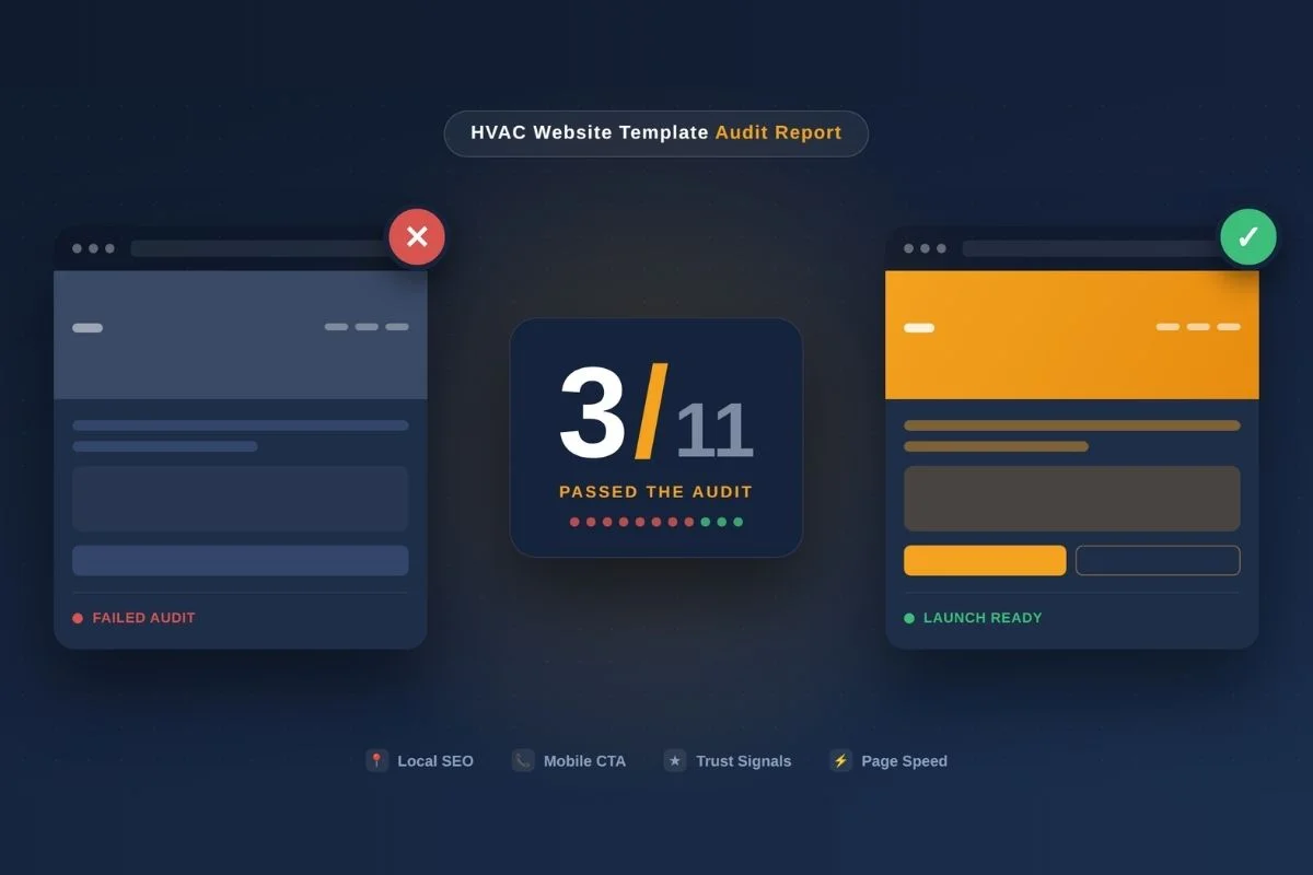
No local signals anywhere. The site had no way to tell Google what city this business served, what zip codes it covered, or where the jobs actually happened.
Google had no reason to show it to anyone nearby. It was not penalised, it was just invisible, like a shop with no sign and no address.
The Hidden Cost of a Generic Template
Here is something most buyers find out too late.
Generic marketplace templates are built to work for every industry, a furniture store, a pet shop, a clothing brand, a jewellery boutique. To do that they pack in features, layout options, and plugin dependencies that have nothing to do with your business.
The result is a template that is bloated before you even install it. Slow to load. Heavy with unused code. Requiring ten to fifteen additional plugins just to function at a basic level.
And every plugin you add is a point of failure. A compatibility issue. A security gap. A performance drain.
Most buyers look at the price of a template and think they are saving money. What they are actually buying is a foundation that will cost them in developer hours, plugin subscriptions, and lost sales before the store ever finds its rhythm.
What Conversion Actually Looks Like Inside a Template
When a template is built for conversion the evidence shows up in details not in the hero image.
Checkout flow. Minimal steps, no forced account creation, clear progress at every stage. If the checkout buries payment behind a registration wall that friction is baked into the foundation. You cannot redesign your way out of it later.
Product page structure. Product name, image, price, decision point, add-to-cart in that order, above the fold. Templates that prioritize visual balance over this sequence make customers work harder to buy. That extra effort shows up directly in cart abandonment.
Trust signal placement. Security badges, review counts, return policy these need to live near the point of decision not buried in the footer. A template with no natural home for trust signals near the add-to-cart button was not designed with real buyer psychology in mind.
Mobile behaviour. Over 70 percent of e-commerce traffic is on mobile. Responsive design is the minimum not the standard. The real question is whether the template was designed for a thumb not a cursor. Tap targets, sticky cart bars, smooth image galleries these separate a mobile-ready template from one that just technically works on a phone.
Speed out of the box. If the demo version of a template is slow the production build will be worse. Page speed affects both conversion rate and search visibility directly. A one second delay in load time can reduce conversions by seven percent.
The Part Most Buyers Completely Ignore
Most people spend hours comparing homepage designs. Almost nobody looks at the checkout page before buying a template. That is exactly where most stores lose their customers. The checkout is the most critical page in an e-commerce store. It is where buying intent either converts into a sale or dies quietly. A well-structured checkout strips away unnecessary fields, keeps the layout clean on mobile, and removes every possible reason for a customer to second-guess themselves at the final step. A poorly structured checkout does the opposite. It asks for information that is not needed. It forces decisions that create hesitation. It looks different from the rest of the store and breaks the trust that every previous page worked to build. Most template buyers never open the checkout page during evaluation. They find out it is broken after launch when the cart abandonment numbers start coming in.
Reviews Are Not a Design Element
Another thing most template buyers overlook: where reviews live on the page. Most templates drop a testimonials section somewhere on the homepage and call it done. That is not a trust system that is a design block. Real trust building means reviews appear at the point of decision. On the product page, near the add-to-cart button. On the category page, near the collection. Not just on the homepage where a visitor has not yet decided what they want to buy. When a customer is about to spend money on something they cannot physically touch, a review sitting three scrolls away from the purchase button is almost useless. A review sitting directly beside it is doing real conversion work. The placement of social proof is a structural decision. Templates that get this right baked it into the architecture it was not added as an afterthought.
The Question Most Buyers Get Wrong
Most buyers evaluate templates by asking: does this look like my brand?
The better question is: does this make it easy for my customer to buy?
Aesthetics can be changed after purchase colors, fonts, imagery. The architecture mostly cannot. The checkout flow, the page structure, the placement of conversion elements are baked in from day one. You will either benefit from those decisions or work around them for the lifetime of the store.
Why Where a Template Comes From Matters
A template built by a designer who has never run a real store will make different decisions than one built by someone who has watched real customers abandon real carts. The difference is invisible in a preview. Your customers feel it in the buying experience. The best templates do not start as templates. They start as live client projects, get tested in real markets with real customers, and become templates after the decisions inside them are already proven. That provenance is what separates a design experiment from a business tool.
A Real Example
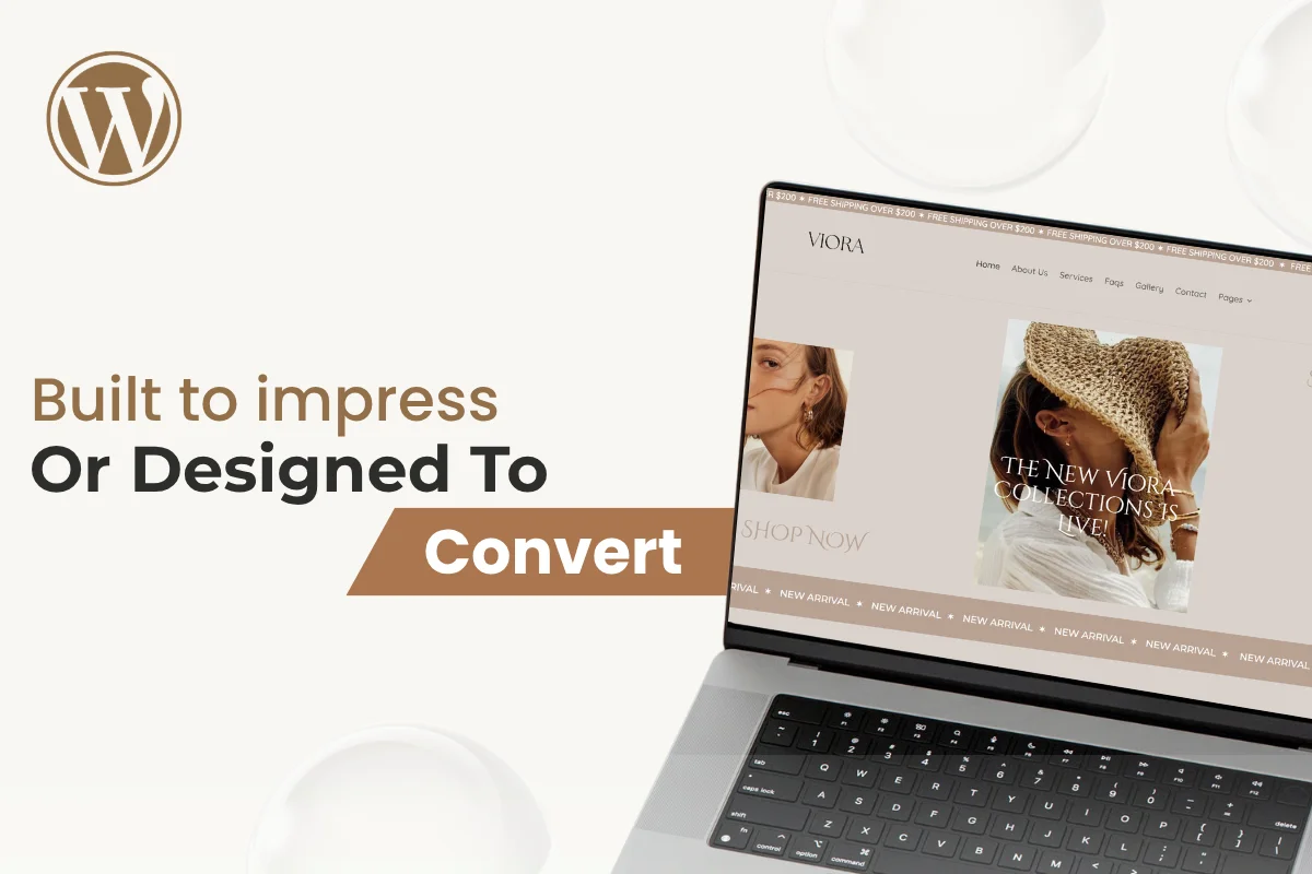
Viora is a jewellery e-commerce template built on WordPress and Divi with WooCommerce. It did not start as a template. It started as a working jewellery store built for a real client in a competitive market. That changes everything about the decisions inside it the lightweight plugin architecture, the checkout flow built to eliminate drop-off, the trust signals positioned where buyers actually need them, the mobile-first layout designed for real browsing behaviour. None of it was assembled for a preview. It was built for a real store and tested against real customers. That is what a purpose-built template looks like.
The Decision You Are Actually Making
When you buy an e-commerce template you are not buying a design. You are buying a set of pre-made decisions about how customers move through your store where they pause, what reassures them, how easy or hard you have made it to complete a purchase.
A template that looks good gets you compliments. A template built on conversion logic gets you sales.
The difference is not visible in the preview. It shows up six weeks after launch in your analytics, your cart abandonment rate, and whether the store is actually growing.
Choose the template based on the decisions it made before you ever opened it.
Built From Real Work, Not Design Experiments
At Themesrush every template starts as a live client project. The structure, typography, color logic, and conversion decisions come from building real stores for real businesses in competitive markets not from a design studio working in isolation.
If you are launching a store or building one for a client, start with a foundation that has already been tested where it counts.


Sorry to hear that you’re not Satisfied.
Please provide us with your feedback and we’ll do our best to improve.
About the Author

Faizan leads the E-commerce division, focusing on structured visibility, paid acquisition strategy, and high-conversion storefront design. His approach blends search presence, brand authority, and performance-driven funnels. At Themesrush, he builds product-ready website frameworks that help online brands scale without rebuilding from scratch.
More about Author
Find Your Website Issues
Free audit request.